We know the importance of company brands and logos. And how firms use these designs in their marketing strategies. Today, we look how to generate a competitive advantage via animated logos.
Background on Logos
According to the Business Dictionary, a logo is a:
- The Guide to Great Logos
- Updating/Redesigning Logos: Is the Time Right?
- A PayPal/Pandora Logo Battle
- The Psychology of Color
- Logo Lounge
- Free Logo Design
Look at this infographic on top traditional logos. It is from Designbeep. And click for a large version.

Competitive Advantage Via Animated Logos
In recent years, many firms have seen the value of animated logos. Take a look at examples.
As Anil Parmar notes for Just Creative: Want “logo animation ideas? You’ve come to the right place. Animated logos have the power to draw attention and communicate messages in ways that a static logo can not. Get inspired by these 20 famous animated logo designs.”
Parmar highlights “20 Famous Animated Logos for Your Inspiration.” And we show eight of them. These include Amazon, Intel, Burger King, Fanta, Uber, MasterCard, Spotify, and Nike.
“The Amazon logo not only delivers a smile but it also depicts that they sell everything from A to Z.”
![]()
“Intel is the world’s best chip maker. The logo conveys this. And it shows that Intel supports tablets, computers, and mobile phones.”

“The Burger King logo is animated in piece by piece, in a 3D manner.”
![]()
“The bubbly fun nature of the type and orange circle shape is brought to life with animation.”

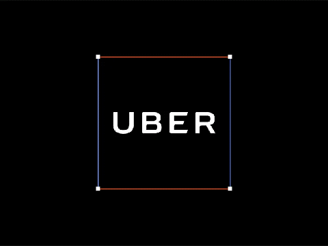
“Building on the line ways points of a map, Uber creates a nice sequence to reveal the logo.”
“MasterCard illustrates its many uses. Such as experiences, travel and food. And Priceless.”

“Get instant access to millions of songs with Spotify.”

“The Nike Swoosh animated with bright vivid paint. Thus, highlighting the active nature of the swoosh.”

After looking at the logos, What’s YOUR take? And which of these do you like best? Why?
It is clearly evident that animation is simply captivating and eye catching. The bright colors and flashy visuals are more aesthetically pleasing than a normal print ad. However it is important to not rely on just these animated logos. A company should first build notoriety through a static logo, being that a moving gif is not exactly possible on say magazine, or print ads.
There is always a need to have a great and recognizable logo. Then, people can instantly affiliate a product without even fully seeing the name. Anything that has more color, a unique shape, or provides movement is more catching to the eye than something boring and run of the mill. If people can recognize the logo, then they will recognize the product, therefore creating more sales (if they have a positive view of the logo)
To answer the last question of the post, the logo I like the best is the Nike logo. It fits the criteria of a successful logo. It is quite simple, yet very recognizable. Compared to the other animations above, the Nike one I thought was most captivating.It is important for a big company as such to have a distinctive and recognizable logo.
Animated logos can be quite captivating, which is important because a consumer may be more likely to look at the ad for a longer period of time if it isn’t static, as moving parts capture attention. For this reason, I think the most effective of these is the MasterCard logo because it shows the different purchases that can be made with the card, and is also fun to look at. As it is colorful and moves quickly, it isn’t very tedious to watch until the brand logo pops up at the end.
I know most products due to their logos and eye catching graphics. I find this extremely imperative. They are captivating and attention grabbing. Anything with bright colors and good context is sure to work. However, this cannot be the only thing a company relies on whilst marketing.
A logo plays an important role in a company, because it will appear in the products, adv, newspaper and everywhere. A good logo will bring a good brand image to customers and customers will remember it. At the same time, in fashion industry, customers are willing to take pics of logos from luxury brands, so a good designed logo seems more important.
While the animations are quirky and fun, I feel like they don’t show the company logo effectively. For someone just scrolling down the page quickly without waiting to see each logo, one wouldn’t know who half of these logos belong to while in mid-animation. While these logos would be a fun change, I don’t know if they should be anywhere but on a commercial where one watching the entire time. I think that for online marketing, these animations, as they are currently, would be a detriment. They would have to be improved so that it is clear whose logo is being advertised through the animation instead of just at the end.
The animations of the logo is captivating and effective. The animation makes the company seem fun, relaxed and not static or stringent, and current. The animation is also effective such that it can display what a company does in less than two seconds. For instance, Burger King’s animation is making them a burger (their brand name is already obvious as to what they produce but nonetheless the animation brings the message across). Or Uber with the points and lines to reflect a map and its destination points.
Logos have always had significant meanings since their inception. They always have underlying meanings and captivating designs. For example, amazons logo not only shows a smiley face but the line connects from A to Z meaning that they sell everything. Personally, Nike is my favorite logo because with one glance everybody knows what company it is. I like how it’s not a complex logo and it’s to the point.
I think the animated logos are more exciting and it brings the viewers attention to it because it is a moving icon instead of just seeing a logo. Especially if its on a advertisement on the side of your screen, you will more liking look at it if it is moving than if its just a image. I understand why animated logos work and think all companies should try this method of marketing.
I think that it is definitely true that companies with animated logos have a competitive advantage in the market place. Animated logos really draw in consumers’ attention and make them want to find out more about a company, or buy from a company. I personally really like the Amazon animation logo. Amazon’s logo is simple, yet very effective. As stated in the post, the arrow pointing from a to z shows how amazon sells just about anything. Additionally, the arrow then forms a smile, which could possibly signify how consumers feel after they make a purchase on amazon. Amazon makes purchases fast, simple, and painless, which is all properly captured in their animated logo.
This post is so interesting and in my point of you, an animated logo works times better than a normal one. I think they will do great jobs in catching people`s eyes, so that the businesses can gain more revenue.
Animated logos are the easiest and smartest way to get more competitive advantage for the different companies. Via animated logos, they can attract consumer interested, and consumer can easier to remember. They’re bring lots of fun in our life, through to see these animated logos, we can easier to know what products they want to present and what could consumer use for them. This is the most effective way to advertise.
I believe one of the things which makes the logos stand out, apart from the physical graphic, is the brand which stands behind it. In particular, in the case of Microsoft, the logo has changed dramatically over the years, yet it continues to be a strong logo due to the brand that stands behind it.
I do agree, however, that animation can help make the logo stand out more. The animation might assemble the logo in a creative way, which might draw the attention of viewers. People are interested in shiny and flashy objects, so a good animation might draw people’s attention.
For that reason, I have two favorites on this list. The first one which drew my attention was the Nike logo animation because it showed flowing paint in vivid colors. The animation has a lot of energy, and is very aesthetically pleasing.
The other one which I was drawn to was the Burger King logo animation, because it assembles the various parts in a unique way, and seeing how all the constituent parts come together is satisfying in the end.
Animating the logos of companies really helps to provide insight on what kind of products they offer, what industry they are involved in and so on. Creating an animated logo that capitalizes on the attention of consumers helps to emphasize certain aspects of the company it represents and portray it to consumers. Some logos take an interesting multi message role, such as amazon with the smile, also implying they carry all products A through Z. Putting in the effort for an animated logo will help companies create a positive stigma towards their products and catch the attention of consumers, impacting business in a positive way.
I like animated logos than ordinary one because it is cool and fun. In those eight animated logos, I love the last Nike one most. The logo is clear, and the color is bright and impact. It reminds me freshness when I do sports. It is a great animated logo.
Animated logos are important as they capture the attention of a consumer whose eyes will naturally be drawn to a moving image. For me personally, I like the simplicity of the Nike and Spotify logos. The Nike logo capture the image of motion that they aim for, while Spotify is also simple, yet moves in a way that incites the idea of sound which is their obvious goal as a music streaming app. With technology being more present in more locations, I suspect that moving logos will be more and more common.
It is said that Uber’s animated logo is inspiring, but I have different view actually. If I don’t know Uber, I would have associated that Logo with some technological brands, i.e. IBM, because the animation is like programming. In contrast, the Nike logo is my favorite. The dynamic moving could easily make me associate with exercise, which is exactly the Nike.
I think the best logos are the simplest logos. Simplicity ensures that the viewer understands the logo and easily recognizes it. I think the apple logo is a unique scenario because it used to be the same general shape but with colors. Apple changed it by maintaining the same idea while giving it a modern update. I think animated logos must maintain the same simplicity while drawing attention.
Animated logos are a great idea. While a “picture can communicate a 1000 words” as the old saying goes, a video can communicated even more in a short time period. As the world becomes more digitalized, I think the use of logos such as these can become even more common. Even signs on different stores we would not expect, such as McDonalds can be animated with the use of a large digital screen. I think they will gain in popularity for marketers due to the larger amount of information they can give the consumer including brand values and attitude (more on the consumer’s subconscious rather than conscious manner).
Animated logos have become more and more popular to help allow companies communicate what they do in a few seconds. Although traditional, non-animated logos have been used in the past to help establish a brand and a company’s reputation in their market, the use of animated logos can help establish a company with only a few seconds more. I do feel that animated logos are a good way to help show what your company does, like the MasterCard logo, but I do not believe that company’s in the future should depend solely on this. I believe that a company should not use animated logos until it has at least established itself and been able to differentiate themselves from other companies. The use of animated logos should be used to then better separate them from other companies. Even though, animated logos are beneficial, companies should be sure to use it effectively.
Logos play such an important role in how a company is built. Take Nike for example… I whole-heatedly believe the only reason a giant chunk of their merchandise sells is because of that check. A lot of the people purchase their clothing don’t even exercise or wear the clothing regularly, but that check is like a virus. It’s worth something in society’s eyes and people want that.
I personally like simple logos, the golden arches for example you know right away thats McDonalds. When you see these iconic logos it allows you to trust and kind of know what service you will get when you go in and i think thats important. Animated logos are a good way to catch peoples attention and especially the younger generation.
Logo should be a remarkable sign for a product. Many companies design a simple but arresting logo to attract their customers. A nice logo could have the company to marketing their products. For example, I like Apple company’s logo. It’s a simple sign which is an apple without a bit. It is easy to remember it. People can easily find the logo on the every Apple products. It is a great way to marketing their product.
I think the key to a successful logo is its simplicity and signature style. Whether it be colors, fonts, or pictures, if it is simple, then people will remember it. I noticed how google is the only company out of the “world’s best logos” to incorporate multiple colors and vibrant colors all in one. Additionally, I noticed how most of the logos either use blue, yellow, red, or white. I am assuming these choice of colors have a reasoning behind them.
Logo and advertisement are very important for a company. Logo can catch people’s attention, and advertisement can let people know your products effect and benefits. Animated logos can easily catch people’s eyes. People should advert your brand first, and then they can come to understand your product deeply.
It’s no doubt that animated logo is better than just a logo, because it’s more visible element you can see from animate logo. All the logos show above, if they are just a logo, amazon may be the best I like. But for its animated logo, it doesn’t provide any other emotion or message than its simple logo. But Nike’s animated logo, you would feel more exciting, energetic that you may feel it much attractive.
Just some personal thoughts. And I don’t want to be offensive to any brand. Before I write my idea, I read all the comments up there to see if anyone has the same taste like I do. Luckily, I found someone who also likes the MasterCard animated logo. Maybe the animated logo for MasterCard is a little bit more complicate comparing with those for other brands. But there was never a time limit for an animated logo. For me, the MasterCard animated logo is colorful, informative which tells you exactly what this company is doing. The most important thing is that, it looks like a very short commercial and is eye-catching. Thats what I expect from an animated logo. A lot of people mentioned that they like the Nike one. However, I don’t really like it. It is simple, colorful, and related to what this brand do. But for me, the Nike one is too abstract. Usually for those non-animated logos, they are abstract themselves. I don’t expect too abstract idea from an animated logo. For those consumers who know the brand very well, this maybe cool. However, a better animated logo as I think should attract those new consumers who has little information or even no information about the brand.
I really think that having an eye-catching logo is important to a company. If this is achieved, then the company is basically half successful. In the competitive there will be a clear advantage. The rest is to see how the company is developing and dealing with it.
Types of logos that can be changed to fit specific uses for the companies have always been in play, which is why the animated logo makes sense in the evolution of personifying products. In the same that Google can change its appearance everyday for everything the company wishes to support the animated logos provide more possibilities and options in ways to interpret the companies message. Additionally, the animated logo creates a feeling for companies that goes along with their brand, which seems to be catering more for younger people in some cases.
Animated logos, while important, are not necessary for a company in today’s world, but it only helps to give that firm an edge. Companies like Tesla that are looked at as young, innovative, and technological are considered to be pushing the boundaries in all aspects of life and one such thing that they have done is animate nearly the whole website from the moment that you type in their domain name.
Every business needs an effective logo design. It’s the only thing which can help you identify your brand. So, it’s always need of having an effective and unique logo to stay in this competitive world. And Animated Logos are effective. It attracts everyone’s attention. Ir draws more people to your business.
I like what you guys are up too. Such smart work and reporting! Keep up the excellent works guys I’ve incorporated you guys to my blogroll. I think it will improve the value of my website :).